12 minute read. Content warning: mild/brief mention of physical discomfort
chatGPT Summary: Kay shares their creative process during the 2024 Kickstart Disability Arts Residency, detailing the steps and challenges of creating a series of prints inspired by nature, from initial sketches and carving to printing and experimenting with hand-modified techniques, all while reflecting on the residency’s creative environment and the role of AI tools in their writing and artwork.
Brackendale on Squamish Nation Territory – As a last-minute addition to my luggage, I threw in my printer ink, brayer, ink pad, and three uncarved pieces of pink rubber I had swiped from a previous tactile art project. I had proposed working on a script and a zine project in my residency application. The short film was ultimately put on hold as one of my other art collectives was taking a long hiatus, and I was still unsure if my zine idea was too big to boil down for in this format effectively. Still, I was excited about the creative possibilities the mountains and forest might inspire, so my carving kit was a good addition.
When I arrived, I staked out a corner of the basement in the large farmhouse where the 16 artists were gathered for this two-week residency. The others gravitated toward the outdoors, soaking up the sun, but after my daily 20 km walk and too many mosquito bites, I was happy to settle inside. I spread out my materials, placing sticky notes and brainstorming ideas for the zine. I started placing stickies with ideas, trying to find a way that I could somehow condense at least 15 years of my own experience and not create a zine that was in a tiny mouse font, and started to wonder if it would be better served as a searchable database or more formal book. I wouldn’t say I abandoned it, but after an hour, my body was protesting. The basement had no table, and laying on the hard, short carpet was not ideal. So I got up and took another walk.
It was on this walk that I discovered Pilchuck Creek. I don’t tend to do much carving of busy forest landscapes because I struggle to create variations to create a landscape with more than one leaf shape. However, this residency allowed me to explore challenges, and I was surrounded by other creative folks with whom I could brainstorm if I hit a snag. I took some notes and a few snapshots of the creek looking (what I believe to be) north, where the water continued past two large dead trees that had become tangled by the surrounding growth and framed a small area just beyond where the light hit it to make it seem like an inviting and enticing little place to visit. I love it when nature creates a natural frame. I chuckled a little at what would’ve been a very muddy and likely disappointing place to walk into, especially with my mesh-topped shoes. Since I was already done with mosquitoes from the farm, I would invite disaster to scale the bridge and walk across the muddy expanse to arrive at that small patch of sun. I was ready to see if I could carve a picture that would create a similar illusion without the muddy and buggy trek.
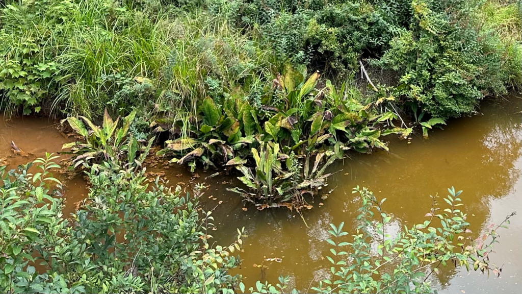
Credit: Kay Slater, 2024. Description co-written with chatGPT 4o.
Once back at the farmhouse, I started to sketch and was immediately confronted with the challenge of depicting the at least eight different varieties of leafy bushes that surrounded the creek and how I was going to carve with enough variation to successfully differentiate between them while also creating a shape that could be carved into the quickly scored cheap rubber. An experienced carver and printer, I also recognize that the more delicate my small carvings, the higher the chance I would only be able to make a limited set of prints before it would degrade and likely be destroyed between washing and drying tests.
I have a very large gesture and typically work from the shoulder or elbow and rely on round and loose shapes when I am forced to work small. This gives my illustrations more of a cartoon or bulbous quality, which I don’t mind but was not particularly suited to this natural scene. When I finished drawing, I noted places I would edit once I transferred the sketch to the pink rubber block. When working with this kind of rubber, I tend to draw it again in pen, feeling the give of my material before I start carving; however, this also reduces the life of the block because the pen can scrape or weaken the density and ultimately affect my later cuts. I tried to keep things pretty loose, and when I had completed my pen sketch, I left it out to dry overnight so I could look at it again with fresh eyes in the morning.
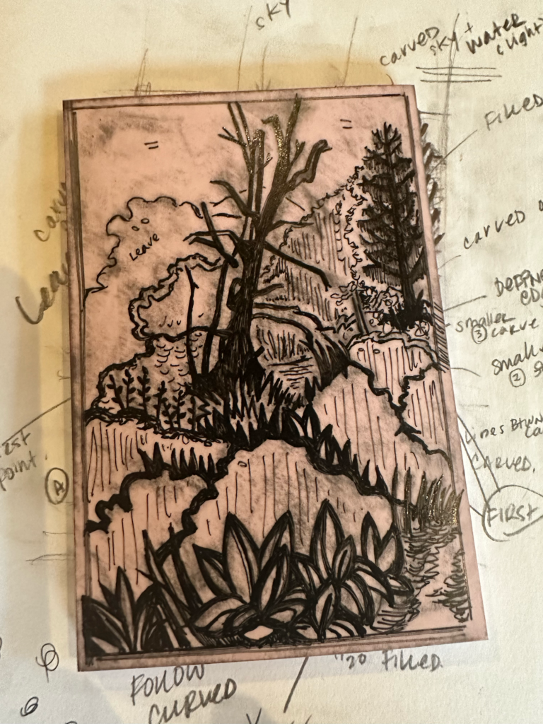
Image description: The photograph shows a pink rubber linoleum block, marked up with black pen lines in preparation for carving, resting on top of a sketchbook page. The block covers the original pencil sketch, though visible notes and annotations can be seen radiating outward from the covered portion. These notes likely outline the carving strategy, with arrows and lines pointing to specific areas, providing a plan for how the linocut will be created. The block itself has not been cut or scored, displaying only the preliminary pen marks that will guide the artist’s carving process.
Credit: Kay Slater, 2024. Description co-written with chatGPT 4o.
The next day
After another long walk, hours before anyone would wake up, I began to carve. I was very conservative, knowing I would probably try a few test prints before creating a series. Again, noting that I was weakening the block’s integrity with each print attempt, I resolved to do only two test prints and then work with whatever happened after that. My first cut was underwhelming. Some of my techniques were unsuccessful, such as puncturing but not scoring, which were barely visible after printing. The illustrative methods I had used to represent perspective made the bushes closest to me look like waves of fire rather than the large lettuce-like leaves of a summer skunk cabbage. The grove or light patch, framed by the dying trees, was unremarkable, and I began to panic about how I would represent depth and light with the surface I had left.
My second set of cuts felt more satisfying, but I remained unconvinced that my small patch of sunlight would translate into anything interesting. I resolved to let go of my expectations and instead focus on the positive space remaining in my rubber stamp and any final changes I wanted before I printed in earnest.
I had not brought any print paper and was limited to some heavy craft paper or my sketchbook. There was only so much I was going to be able to do, so I pulled out a few dozen pages and cut them in half, not taking note of the total number before I set to printing. Looking at the clock, I knew I had about an hour before the earliest of my fellow residents would begin stirring, and since I was going to take up most of the dining room table to dry my prints, I got to work.
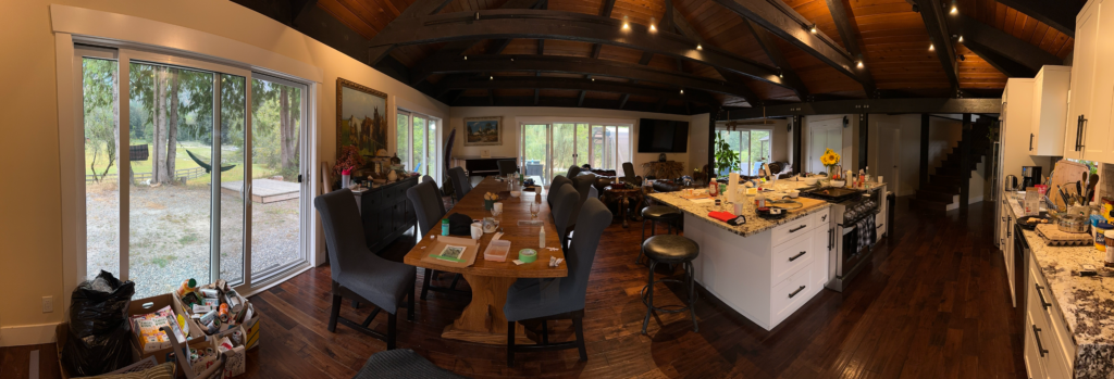
Credit: Kay Slater, 2024. Description co-written with chatGPT 4o.
I created a limited series of 16. Although I see the flaws and inconsistencies in my ink applications and printing, it was a successful set overall. I created 14 additional prints in the same series, each containing some obvious flaw and wanting more attention. I left the prints to dry for a day and hung them on a line while considering what to do with the imperfect dozen.
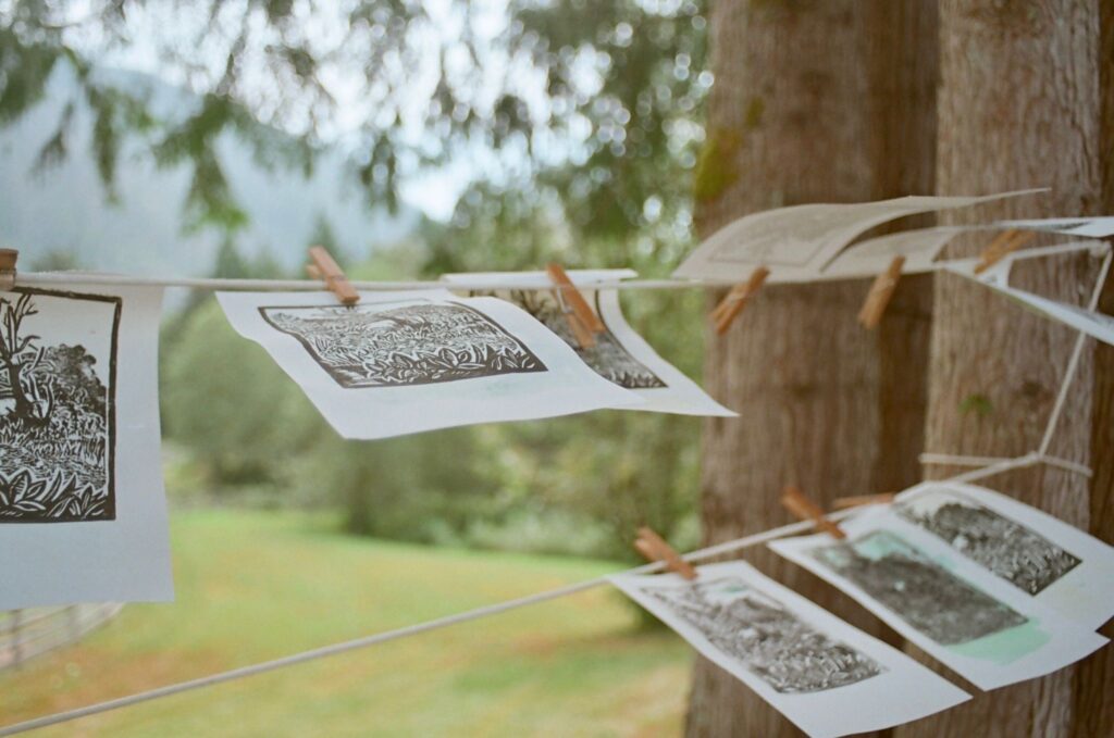
Credit: Ariel, Kickstart Disability Arts Residency, 2024 – shared with permission.
Description co-written by Kay and chatGPT 4o.
Since I was already bringing my ink and printing tools, it only made sense to pack my conte, India ink, watercolours and chalk. I had planned to wash clothes in the sink and so had brought a laundry line to sneak in more art supplies in place of a daily change of clothes. I was glad about this on day three when I started experimenting with this small set of prints. I splashed paint; I crumbled paper, added marks, and chalked over others. I titled the limited set At Pilchuck and numbered the series. For the hand-modified prints, I added a few words to the title, flavoured by the technique used.
Wrapping up
I had brought some soaps to give to the facilitators before I left, but I hadn’t wrapped them. Using some of the leftover rubber, I referenced a book our head facilitator had shared as both a reflection and reference as we considered our privilege as uninvited guests on Squamish territory. The book contained Squamish spellings and medicinal properties of plants found in the surrounding area, and I identified the Pacific Crab Apple Blossom on a few of my walks. A quick carve later, I made a repeating pattern of blossoms for wrapping papers and a simple series of thank you prints for the other artists.
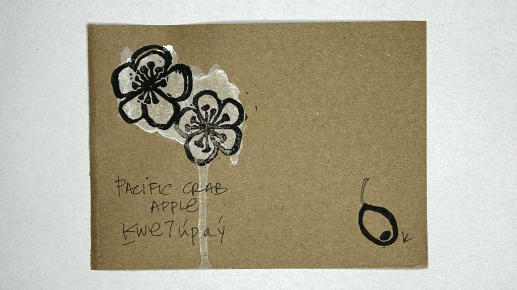
Image Description: This linocut print is made on kraft paper. In the upper left corner, two Pacific Crab Apple blossoms are printed in black ink over a soft, irregular blob of white watercolour that drips down past the edge of the bottom of the page. In the lower right corner, a small, oblong fruit is depicted, also in black ink, with a short stem, next to a small letter K. Handwritten text near the bottom left corner reads “Pacific Crab Apple” and the Squamish language equivalent in NAPA “Ḵwe7úpay” below it.
Credit: Kay Slater, 2024. Description co-written with chatGPT.
Visually describing the HMP (hand modified prints):
The following details the first print in the series of 16 and the 14 hand-modified prints I created after.
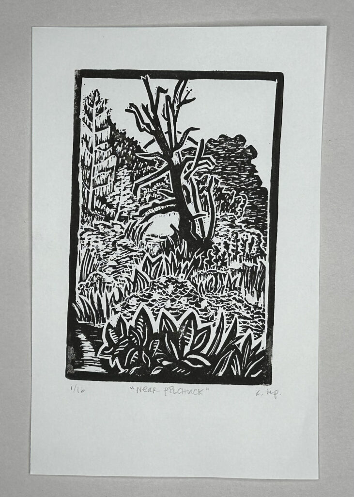
Image Description:
A black and white woodcut or linocut print depicting a nature scene. It shows a barren tree in the center, surrounded by foliage, with various plants in the foreground. Description by claude.ai 3.5 Sonnet and Kay.
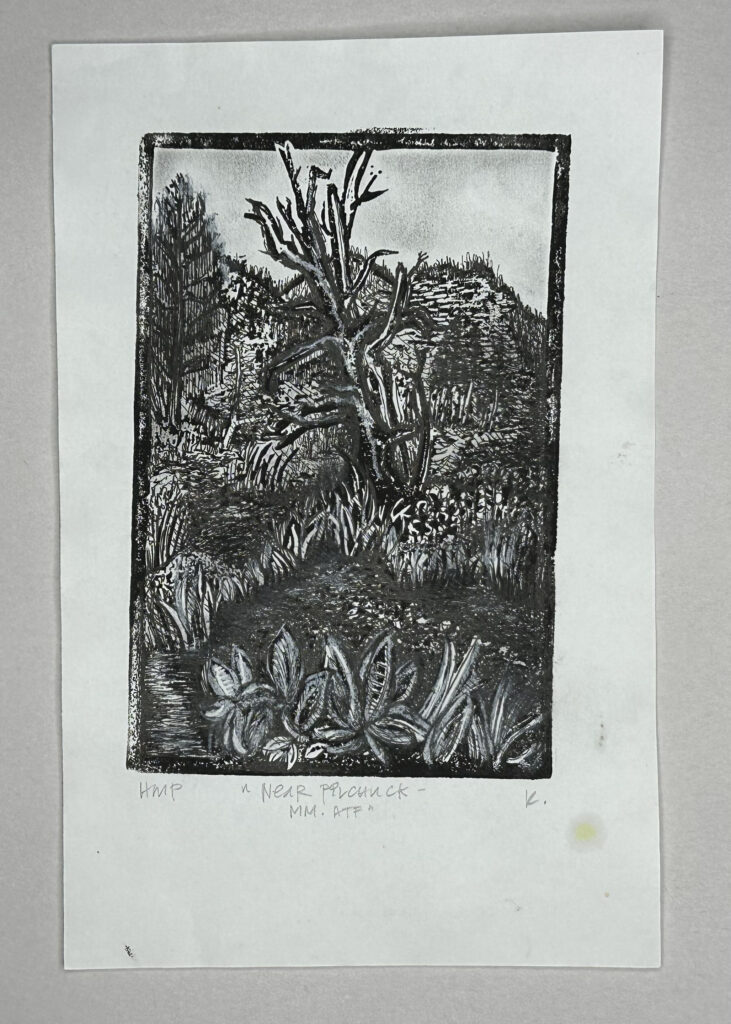
Image Description:
Print modified with white and black conté and ballpoint pen. The sky is worked with smudging techniques, and the clouds are implied by the negative space. Hashmarks and additional details add depth and dimension to the scene. Description by chatGPT 4o and Kay.
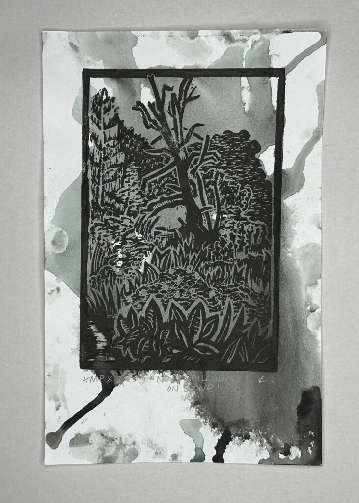
Image Description:
Print modified with a dark, muddy wash of dirty blue watercolour which runs across and beyond the print’s borders. The ink bleeds and moves in splotches, creating an uneven and slightly chaotic composition. Description by chatGPT 4o and Kay.
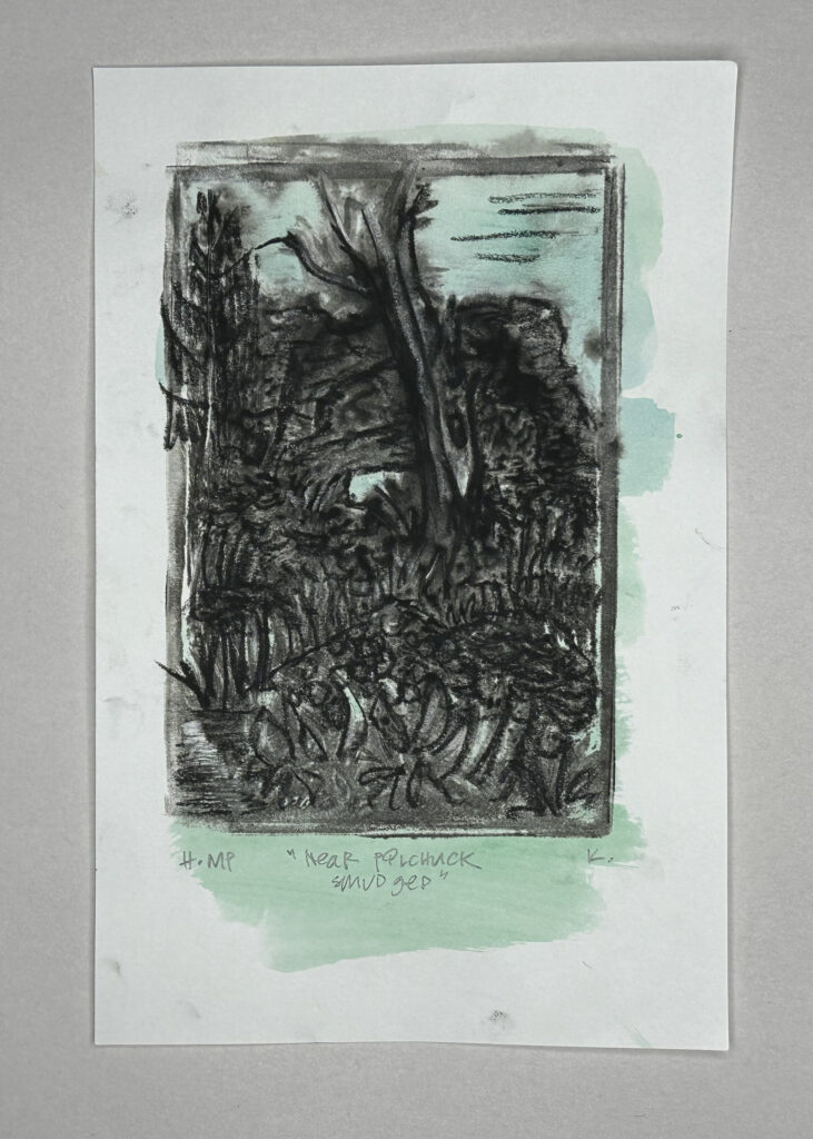
Image Description:
In this modified print, pale green watercolor has been added around the central scene, softening the stark black and white contrast. Charcoal has been used to add depth to the shadows, giving the print a more dimensional look, while areas of conté add subtle texture. Description by claude.ai 3.5 Sonnet and Kay.
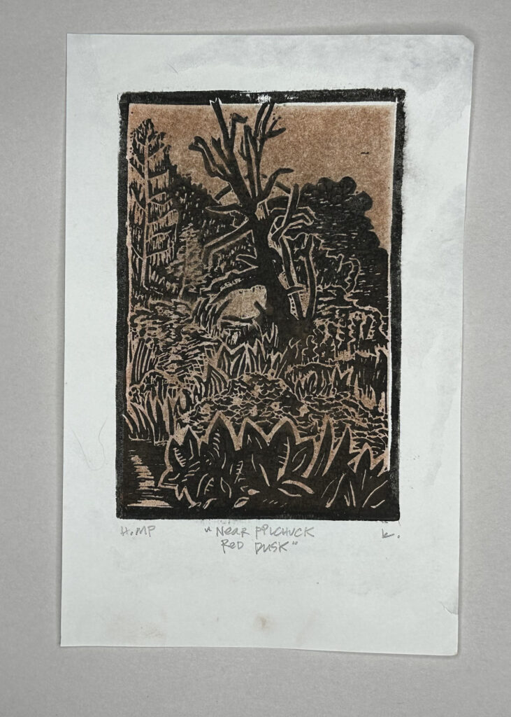
Image Description:
This print has been modified by the addition of reddish-brown conté. Parts of the image have been intentionally rubbed away, creating a faded, ethereal effect. The lighter, worn areas give the impression of weathering or aging, adding a dreamlike quality to the print. Description by claude.ai 3.5 Sonnet and Kay.
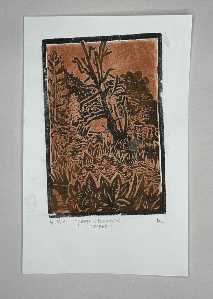
Image Description:
In this modified print, red conté has been thickly but softly rubbed into the dried print. The warm, earthy tone gives the image an autumnal atmosphere. Description by claude.ai 3.5 Sonnet and Kay.
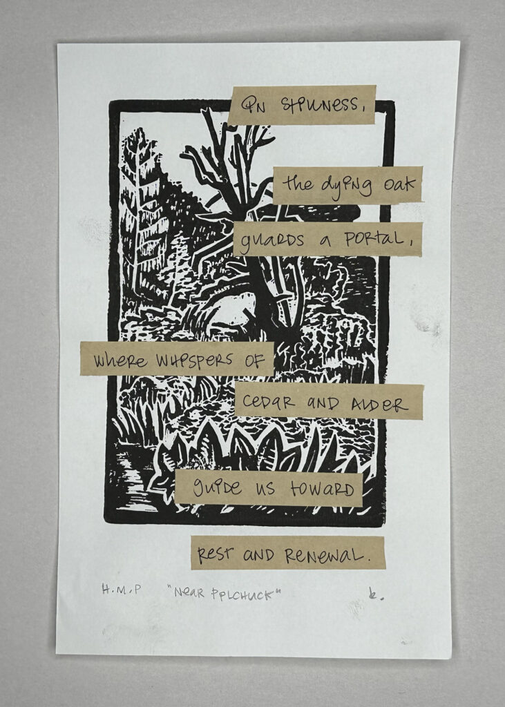
Image Description:
This print has been modified by the addition
handwritten text overlaid on kraft paper strips. The text is a short poem, adding a literary element to the visual artwork. The text reads: In stillness /
the dying oak / guards a portal, /
where whispers of / cedar and alder /
guide us toward / rest and renewal. Description by claude.ai 3.5 Sonnet and Kay. Poem by Kay and chatGPT 4o
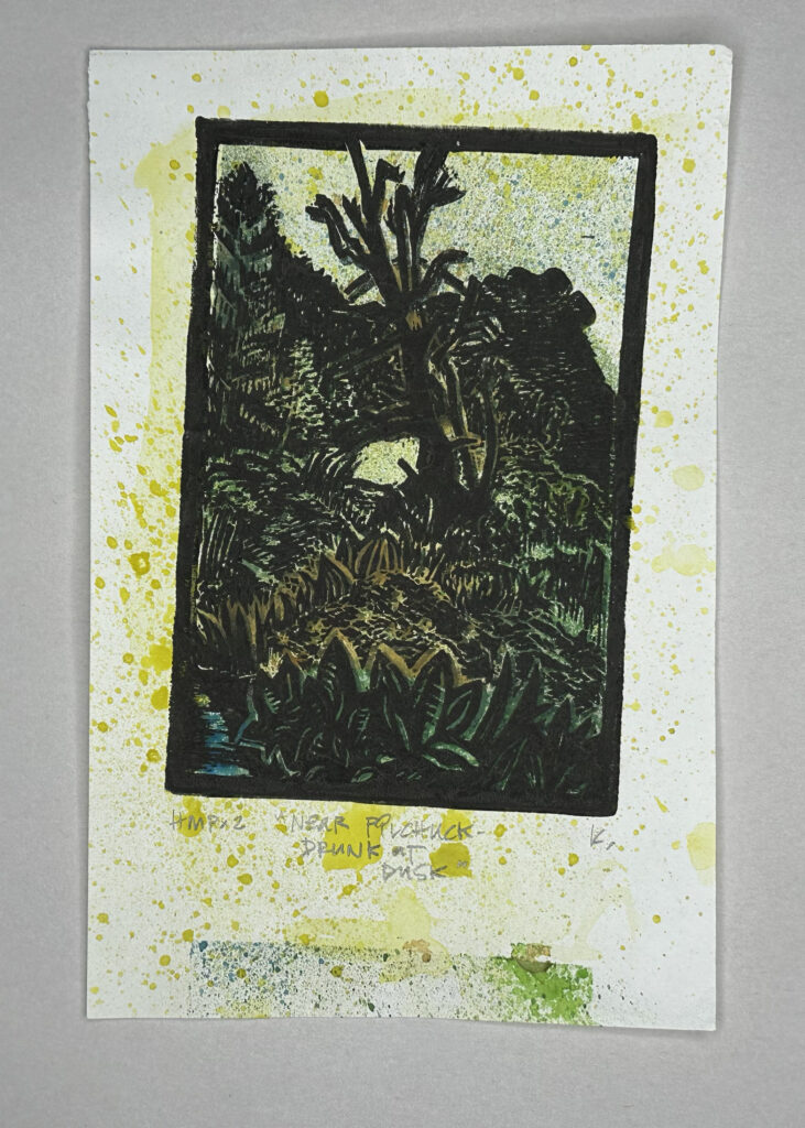
Image Description:
A double-printed image with the registration misaligned, giving the effect of double exposure. The splattered yellow adds to a sickly and unsettling atmosphere, with a patch of accidental green paint at the bottom due to masking slip. Description by chatGPT 4o and Kay.
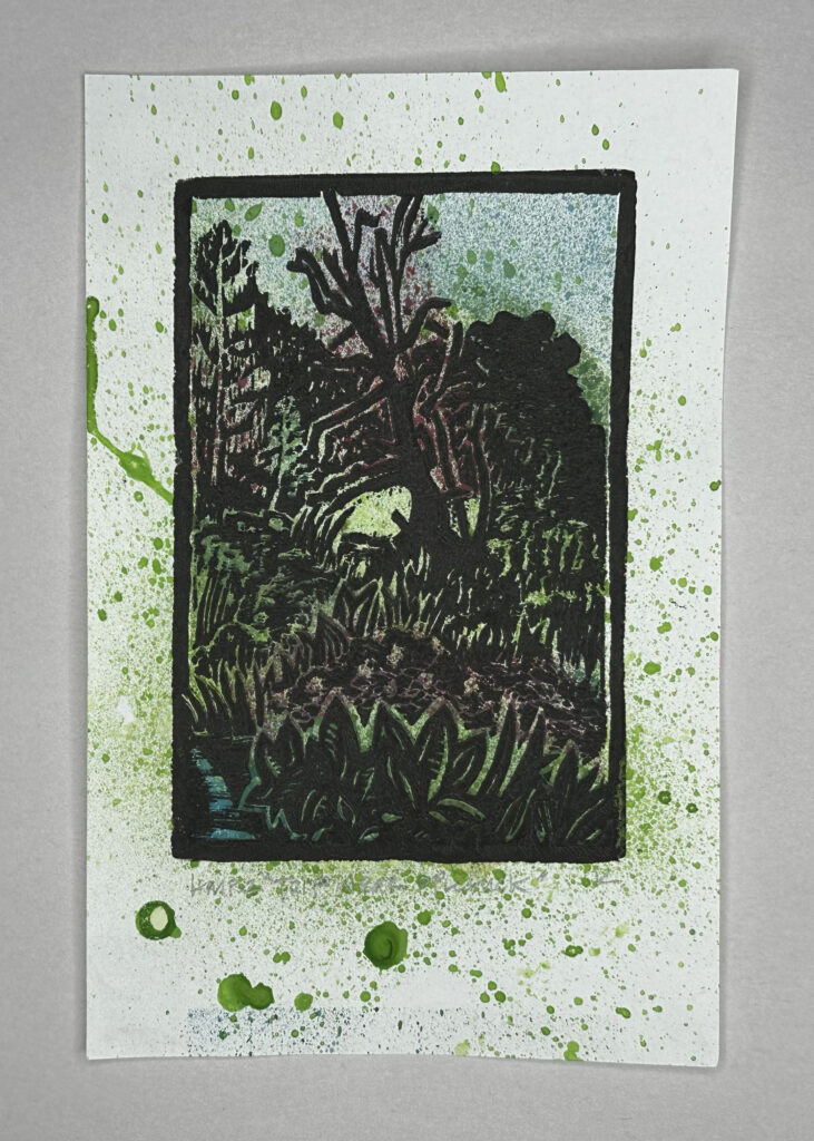
Image Description:
This print is modified through the application of splattered blue and green paint that fills the page and extends past the borders, with hints of pink behind the dead tree. The scene feels messy and chaotic, with energy contributed by the paint splashes. Description by chatGPT 4o and Kay.
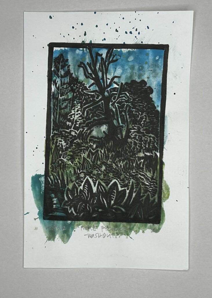
Image Description:
This print is modified through the heavy application of blue and green pigment which forms a dark, muddy colourfield, with fingerprints adding texture in places. The result is a deeply saturated and messy composition, where much of the original print is obscured. Description by chatGPT 4o and Kay.
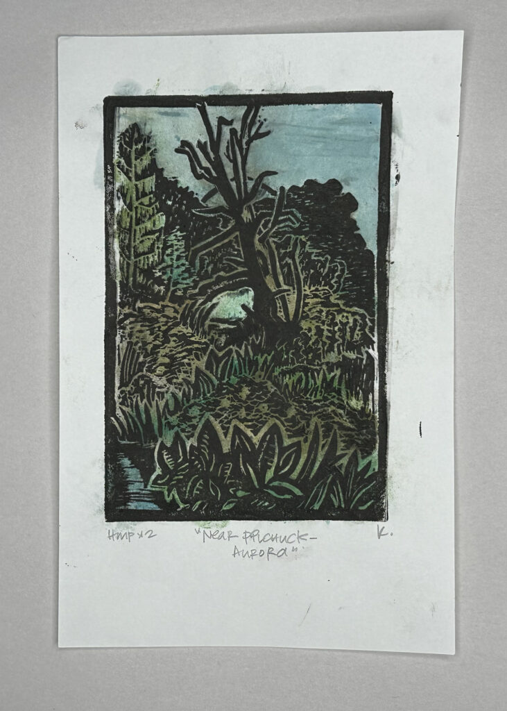
Image Description:
Watercolour has been carefully placed on this print to colour the trees, grasses, and bushes in green, yellow, and red tones. The sky and water are a spotty blue, creating an overall dense and vibrant scene. Description by chatGPT 4o and Kay.
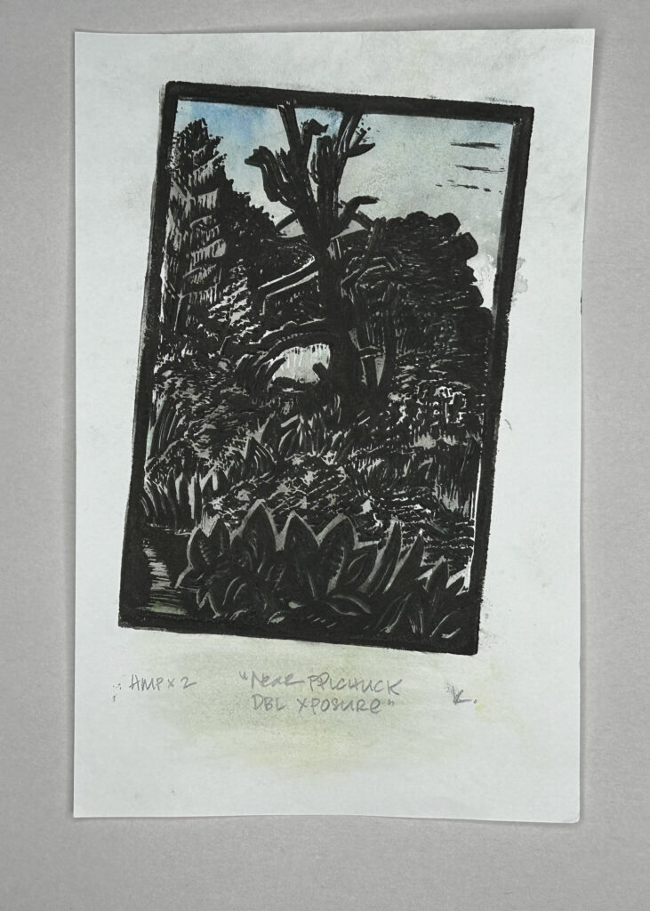
Image Description: The intial print is tilted clockwise, rotated almost 20 degrees from the edges of the page.
The final print is another double-printed piece with slight misalignment, this time overlaid with a subtle blue watercolour wash. The registration shift creates a soft, disorienting blur in the print. Description by chatGPT 4o and Kay.
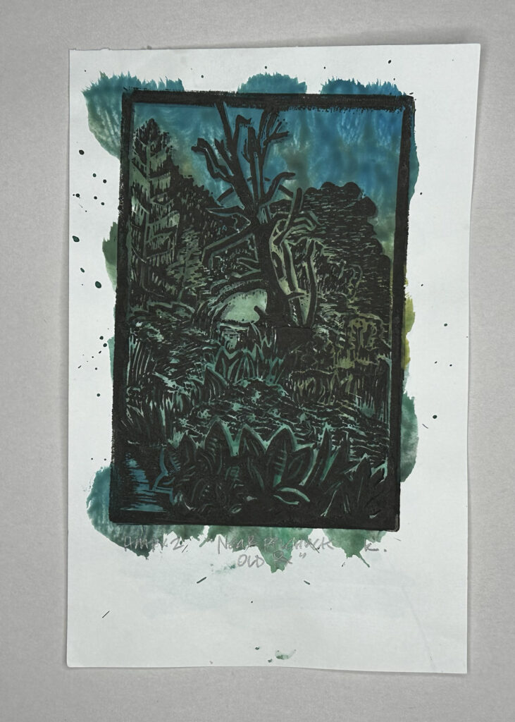
Image Description:
This print has a thick and densly coloured gradient wash of blue, green, and blue-green. The double-printed registration creates a subtle blur, contributing to a soft, disorienting effect. Description by chatGPT 4o and Kay.
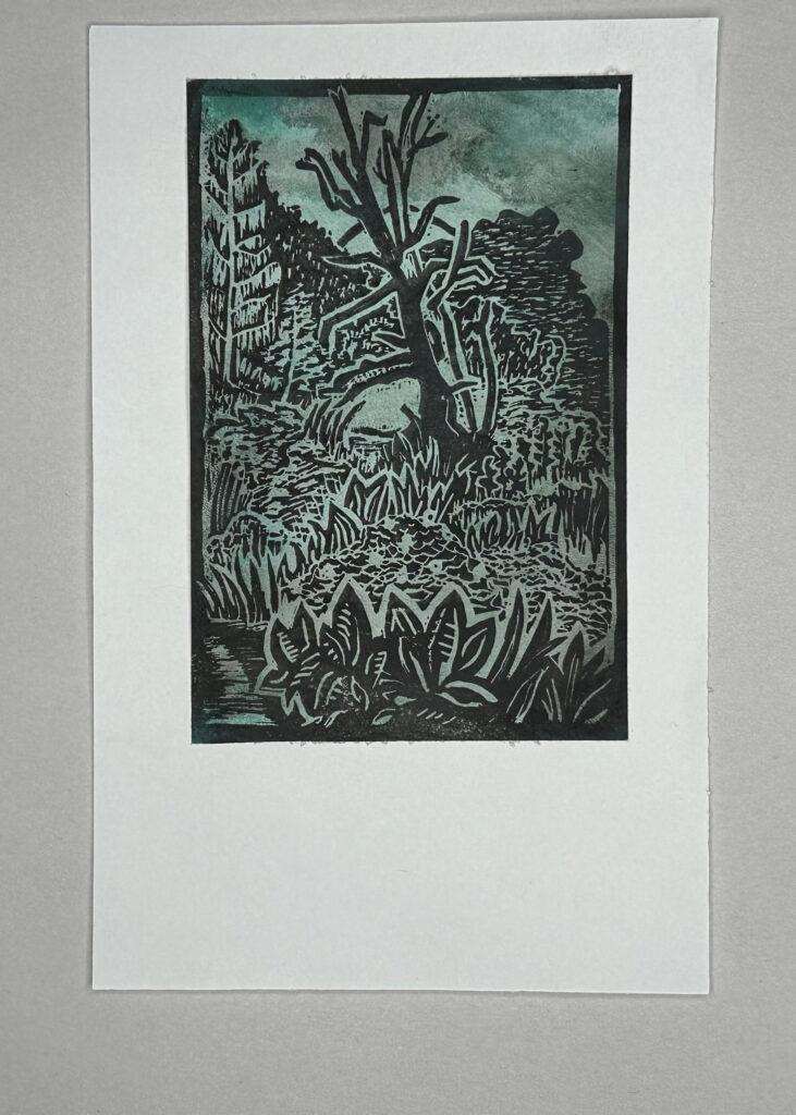
Image Description:
The original print, modified through the addition of a stormy colourfield of blue and green, has been cut out along the border and placed onto another blank 5×7 sheet. The stark white paper contrasts greatly behind the bold colours. Description by chatGPT 4o and Kay.
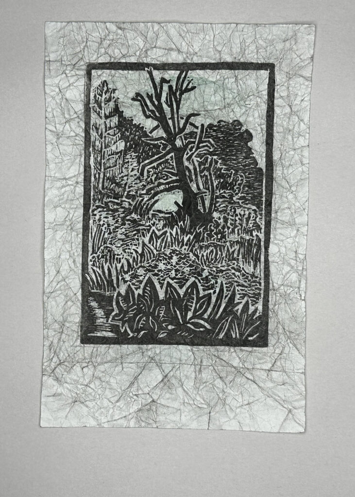
Image Description:
This print features a very light watercolor wash, creating a delicate effect across the image. The paper was crinkled while still wet, with faint ink accents following the creases, giving the piece a textured, weathered look. No printer’s signature or title is present. Description by chatGPT 4o and Kay.
Technology note:
Vancouver, September 6th, 2024 – I continue to test the use of AI within my writing and artistic practice. I used Grammarly to assist me with spelling and grammar.
I initially felt my text was too long and tedious, much like a recipe article when you want the ingredients and methods but where you must first scroll through paragraph upon paragraph of the happy homemaker’s process and dismissal of inferior methods and ingredients, interspersed with affiliate links, and links to other recipe variations, before presenting what you were there to see (much like this sentence).
I asked chatGPT 4o if it could help me edit and condense the text. It did a good job, but what remained were isolated sentences that took me from action to action with little finesse. Reading the edit felt even more boring than my long-winded text. I tried again, asking it to take a middle ground between its edit and my original text, and it completely rewrote it, erasing my narrative style and using words I would never use. It was a good exercise, reminding me (and hopefully you, dear reader) that editing is an important and finicky step. I am grateful for the human editors in my employ and community.
Speaking of chatGPT 4o, I read the AI aggregator website/e-newsletter, There’s An AI For That (TAAFT, Romania), which gives me highlights and summaries of news happening on the subject of chatGPT or LLMs in general each week. Most of the time, it’s pretty ad-heavy with links to articles behind paywalls or focused more on the economics of AI and machine learning, but occasionally, it gives me a list of apps to go check out, and I almost always do. This recent week, the email’s Thread of the Day “7 reasons to use Anthropic’s Claude” started with “Claude 3.5 Sonnet has become the go to LLM for many people around the world…[and] has climbed the ranks to secure its place as arguably the best LLM today.” After reading through the article, I decided to pit the two against each other with a task where I most regularly use an LLM in my recent daily work and practice – drafting visual descriptions.
I quickly tapped out using the free version of Claude 3.5 Sonnet. It had been suggested that the best way to use the service was to get very detailed and stack requests, as every inquiry would cause Claude to go back and review the previous conversation thread. I sent a very lengthy request, including visual notes that chatGPT usually tripped over, to help it with our first interaction.
Kay: I have a series of 15 images to describe. The black and white print, provided in the set of 5 I was able to upload to you, is the first of a short series of 16 prints, all the same and numbered as an edition. The other 14 photos I want to describe represent 14 hand modified prints where the base imprint is the same but due to flaws in the printing, a shifting in the registration, or a dissatisfying pull, I decided to modify the print with some kind of additive process. Assuming that I will share these images on my blog and following a more detailed although still brief description of the first print, each subsequent hand modified print should be described with the modification being the focus of the description. Based on best practices for description for the blind, could you provide brief visual descriptions no more than two sentences for each of the attached prints. following this, I will upload the next five in the series. For context, the work with kraft paper adhesive contains a short poem written by me with the help of chatGPT, the next uses watercolour, charcoal and conté, and the final two use two different shades of brown and red conté as well as different applications with the brown or final uploaded work being rubbed for much longer with kraft paper until the pigment was mostly rubbed away.
Claude 3.5 Sonnet: I understand you’d like brief visual descriptions for each of the 5 attached prints, focusing on the modifications made to the original black and white print. I’ll provide a description for each image, keeping it to about two sentences per image as requested.
Image 1: This is a black and white woodcut or linocut print depicting a nature scene. It shows a barren tree in the center, surrounded by foliage and what appears to be a rock formation, with various plants in the foreground…
For the full response, check out the visual descriptions in the gallery above. I have interspersed Claude’s responses with those I got from chatGPT. Even when I provide many details, I have to clarify or edit them; oddly, chatGPT has started adding subjective notes to its descriptions, even when I ask it not to. I delete most of those lines now as I will add my own subjective observations if a description needs one, but in general, the subjective voice is already in the surrounding text for photos in my blog.
As I mentioned, I only got five image descriptions from my daily free usage on Claude, and although I had some queries left on my daily quota when I tried inputting “please do that again with the next five images,” it said I exceeded the inquiry length. Since I already paid for chatGPT and didn’t see much difference between the two descriptions, I’ll stick with chatGPT for now. That said, I’ll keep the app to test the occasional image, and when my daily allowance re-ups, I’m interested to see how it handles video since chatGPT still cannot do that without speech or a transcript and through a series of snapshots.
chatGPT also created my 1-sentence summary and my estimated reading time and recommended some content warnings, as it has been put to task for the past few months.Otherwise, I used my iPhone’s panorama camera setting to capture the photo of the farmhouse.